Early post today since I have homework and I don't want this hovering over my head.
So, The Guardian. I've mentioned it a few times here before. Basically, it is about a kid who discovers he has superhuman powers in a world where they have been believed impossible. Soon it is revealed that there are millions of others like him across the globe; they have just kept themselves secret. When they reveal themselves, they face great discrimination. Some wish to take up arms against humanity; others strive for equality using peaceful measures. The kid decides to fight against the superhuman movement (hoping it will enable people to see that they're not all bad) and becomes the Guardian.
I think of it as a sister-story to Nightmare City; a prequel which features a bunch of characters who will not appear in the sequel. The tone is much darker, more like a gritty superhero reboot. So the universe goes in the opposite direction of most comic book universes, from "DARK AND EDGY" to "LET'S ALL BE COLORFUL AND HAVE FUN!"
With that explanation out of the way, here is my design for the Guardian:
I like this design a lot. I wanted a gritty reboot design keeping a few elements from the previous version of the Guardian (gun holster strapped to leg, monochrome/red color scheme) and I think I almost nailed it here. There are a few things I'd like to change; the mask looks too Jason Vorhees to me and the sleeves blend into his wings, but these are pretty minor problems. I am a happy person.
And here's Logan, aka X, a highly emotional psychic the Guardian encounters occasionally:
Much better than yesterday's drawing, though I still can't figure out why I draw his hands like that.
GEE, I WONDER WHAT COULD HAVE POSSIBLY INSPIRED HIS CLOTHING DESIGN.
Sunday, February 28, 2010
Saturday, February 27, 2010
It's Really Hard to Name Posts of Little Substance
Friday, February 26, 2010
Logan
Thursday, February 25, 2010
Wednesday, February 24, 2010
Eheheheh
Tuesday, February 23, 2010
Oh hey, 200th Post
I wanted to do something special for this, but frankly I'm exhausted today.
Have some totally random doodles instead, including the dude from yesterday. (Yes, he was inspired by Tron. It's Hal, aka "The Professor," back when he was still a member of A.S.L.E.). Others are Lily, Jack of Diamonds, and a guy who tangentially resembles Peter Cushing.
Labels:
ASLE,
Hal,
Lily,
Nightmare City,
NMC Minor Characters,
Royal Flush
Monday, February 22, 2010
NMC Forever
Sunday, February 21, 2010
Hey Look, They're Done
Saturday, February 20, 2010
Look, a Logo
Friday, February 19, 2010
D'aww Time Is Now
Thursday, February 18, 2010
Doodles
Wednesday, February 17, 2010
Simple and Cute
I wanted to try my hand at writing some fast comics featuring the cast of NMC and realized the style I usually use--the most realistic I've used to this date--wouldn't work for the fast n' funny format. So here's a rough draft of a modified 3:1 style. I'lll probably go with this in the end.
...That is all.
Tuesday, February 16, 2010
Warm-Ups
Today, I drew a lot in my newsprint pad which is bigger than my computer desk. I wanted to take pictures and show you all, but I have no idea where the camera is. I doubt it's even in the house right now...
So you'll have to make do with this crappy warm-up picture. Let's hope I find that camera soon!
Monday, February 15, 2010
Font-making
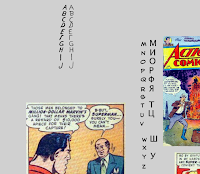
I dislike phonetic accents. They're often difficult to read and not entirely necessary. If I ever made up comics, I would prefer to paint the fourth wall and use different fonts for different accents. I've already set aside various comic typefaces for "American accents" and "British accents." But, you see, I've never really found a typeface that I thought would work for Russian accents. So I'm trying to make my own.
Here is my workspace for building the font. The letters A-J are completed. The column in the center of a picture is reference; I want some of the letters to look like various Cyrillic characters which sound radically different but look similar to the ones provided.
Originally, I was going to use the typeface seen in the M-Z column as a jumping off point for the font, but at the last second I used a Superman comic instead. Partially because I wanted the font to look a little more original, but mostly because I always get a chuckle out of Silver Age stories.
Sunday, February 14, 2010
Pulp and Insects
Saturday, February 13, 2010
Insects and Gastropods, Oh My!
Friday, February 12, 2010
Thursday, February 11, 2010
A Robot and a Monocled Man
Wednesday, February 10, 2010
Character Sheet
Tuesday, February 9, 2010
Design Tweaking
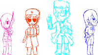
Today I will tell you about how I've mostly finalized the looks for the four vigilantes of Nightmare City!
This is the colored version of the picture from last night. Before I tweaked anyone else, I made a few changes to Lily. Her design was a bit needlessly complicated. Comparing her here to her reference, You'll notice she's lost her pockets, the piping on the shoulders, and two stripes on each sleeve. The buckled bands on the end of each sleeve have been replaced with piping. Her jacket also closes differently, but that's just a mistake I didn't catch until now. Her jacket should still button the other way.
I've been drawing the Professor with dark hair recently, so I change that. Now, the first big problem I see is that the Red Menace has way more color on him than anyone else and thus sticks out too much. I try and change the coat to white. As you can see, the result is hideous.
I change the coat to black and then change most of the white highlights to red. I like this look, but it has created a new problem: the Professor is the only one with a lot of white in the cast, and now he sticks out.
This sticking out is a big problem; I consider his labcoat to be a pretty important element of his design. Removing the coat would also remove the sort of jackety theme I have here. I could color the labcoat black, but seriously, anyone with a black labcoat is trying too hard. Instead I try to mask the problem by making the coat cover less surface area. My eye isn't fooled.
But Mysterie has a flaw that could be more easily fixed...
Remember what I said about everyone having a sort of jackety/military theme? Well obviously Mysterie doesn't. I realize that by adding that theme I could balance the white better and therefore unify the cast. Unfortunately, the poncho I design hides her characteristic boobs.
So the poncho becomes a form-fitting white jacket. With this, the vigilantes flow.
And right before I make this blog post, I make Lily and Anna's jackets button correctly. So there you have it: the vigilantes of Nightmare City.
Monday, February 8, 2010
Design Tweaking (Coming Soon)
I like to consider myself moderately decent with singular character designs, but I tend to be pretty bad at creating ensembles that mesh well. I'd like to use Nightmare City as an opportunity to strengthen this weakness, so I drew all my characters side by side.
Actual tweaking to come when I color these.
Sunday, February 7, 2010
And Oldie but Goodie
Holy crap I thought I had lost this.
"Sadou" (Tea Ceremony) is a picture book I co-wrote with two other students of Japanese. I wrote some of it, but my major contribution was illustration. Character designs were done by someone else but I drew all ten pages.
I did the coloring on a few pages, like the one above, but the project was due in about twenty minutes when it came time to color and I was a really slow colorist so the group pulled together whoever had free time. This was the final result.
The story is not particularly profound--the girl with pink hair (Ayame-chan--perceptive people may connect her to this Ayame, and they'd be totally right) holds a tea ceremony for her friends Hideaki (this Hideaki) and Hanako (who doesn't appear in Medley ha ha). If you can't read Japanese, you're not missing out.
This is probably most notable for being my second completed attempt at sequential art; the first has certainly been lost to time. While "Sadou" is not my best work, I'm still proud of it for what it is.
I don't have anything else to say, so enjoy the rest of the pages without commentary.
Saturday, February 6, 2010
Crappy Post
Friday, February 5, 2010
Let's Just Relax!
I've been drawing a lot of Nightmare City stuff lately and nothing but. You know, I think it would be a good idea to just take a break. I should just try to design a random character like I used to do all the time. Maybe those were all walking cliches, but some good came out of it. And besides, it will be a nice way to loosen my creative muscles. Sounds like a win-win situation to me! What's the worst that could possibly happen?
...Oh.
Well, I certainly didn't expect to subconsciously render what looks like a serial murder and/or rapist is loving graphite detail. Maybe I need to unwind more than I thought I did.
...Oh.
Well, I certainly didn't expect to subconsciously render what looks like a serial murder and/or rapist is loving graphite detail. Maybe I need to unwind more than I thought I did.
Thursday, February 4, 2010
Subscribe to:
Posts (Atom)